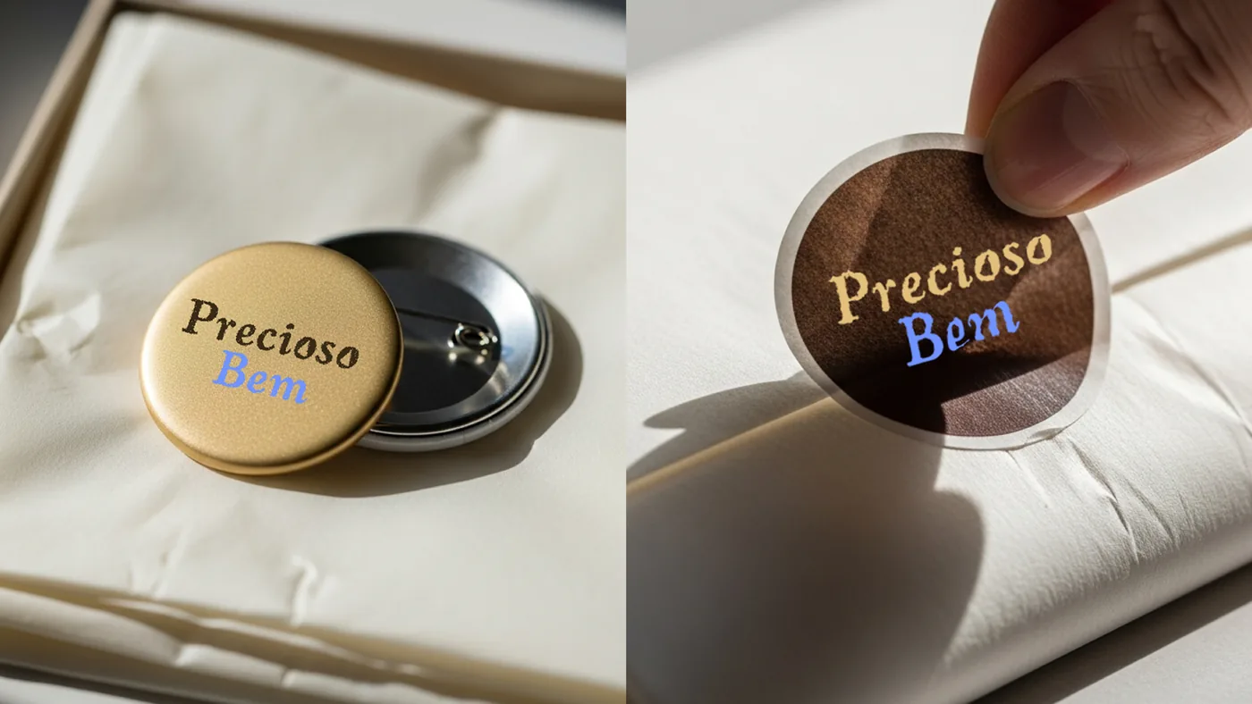
The project
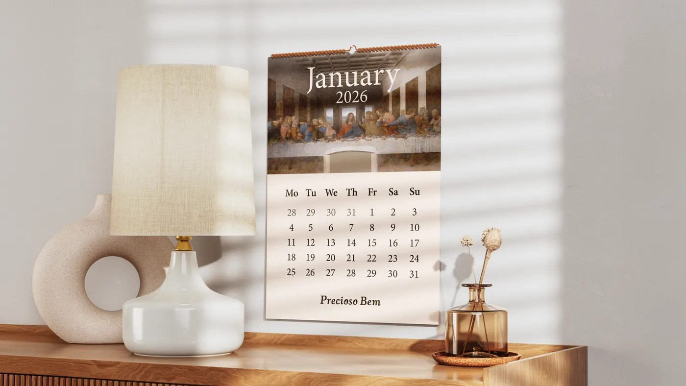
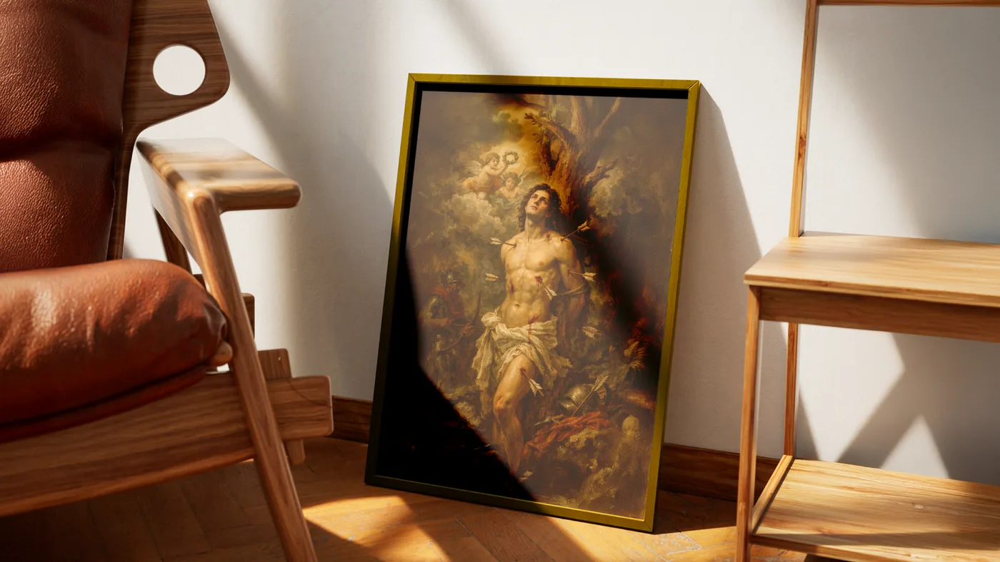
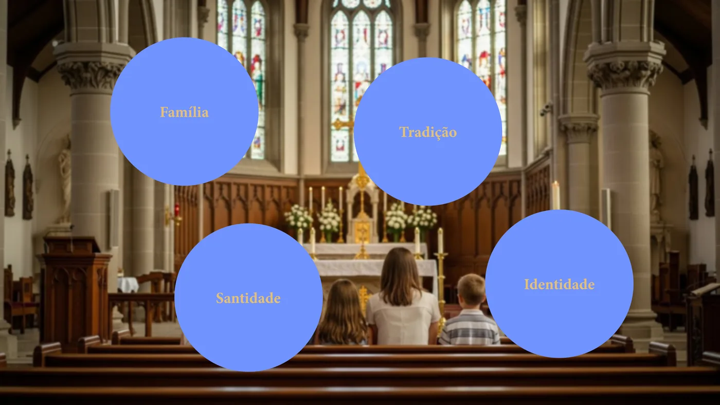
Precioso Bem was born in the heart of a Catholic family, where faith has always been more than tradition: it is daily presence, sharing and witness. Inspired by the values of Roman Apostolic Catholicism, the brand turns devotion into a concrete gesture, creating devotional objects that accompany spiritual life with meaning, beauty and respect for what is sacred.
Every piece carries intention, care and a deep sense of purpose, reflecting the love of a large, close family committed to evangelizing through the details as well.
Typography
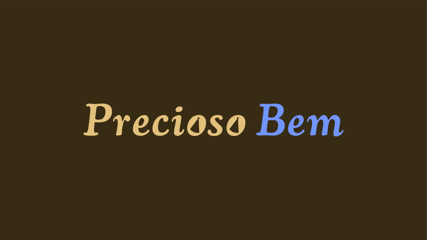
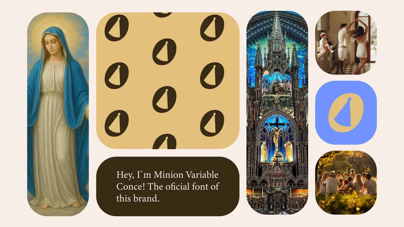
The typography was conceived as a link between tradition, spirituality and warmth. The serif face reinforces the historical heritage of the Church, conveying gravity and timelessness, while the slightly rounded edges of the logotype bring kindness and closeness.
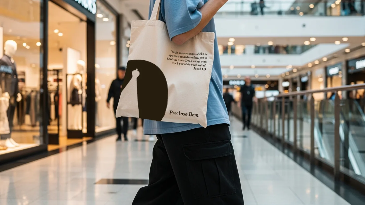
As a distinctive element, the letter O in the logotype was styled with the image of Our Lady of Aparecida in negative space. This turns the typography into a symbol, adding spiritual meaning and singularity to the brand.
Color
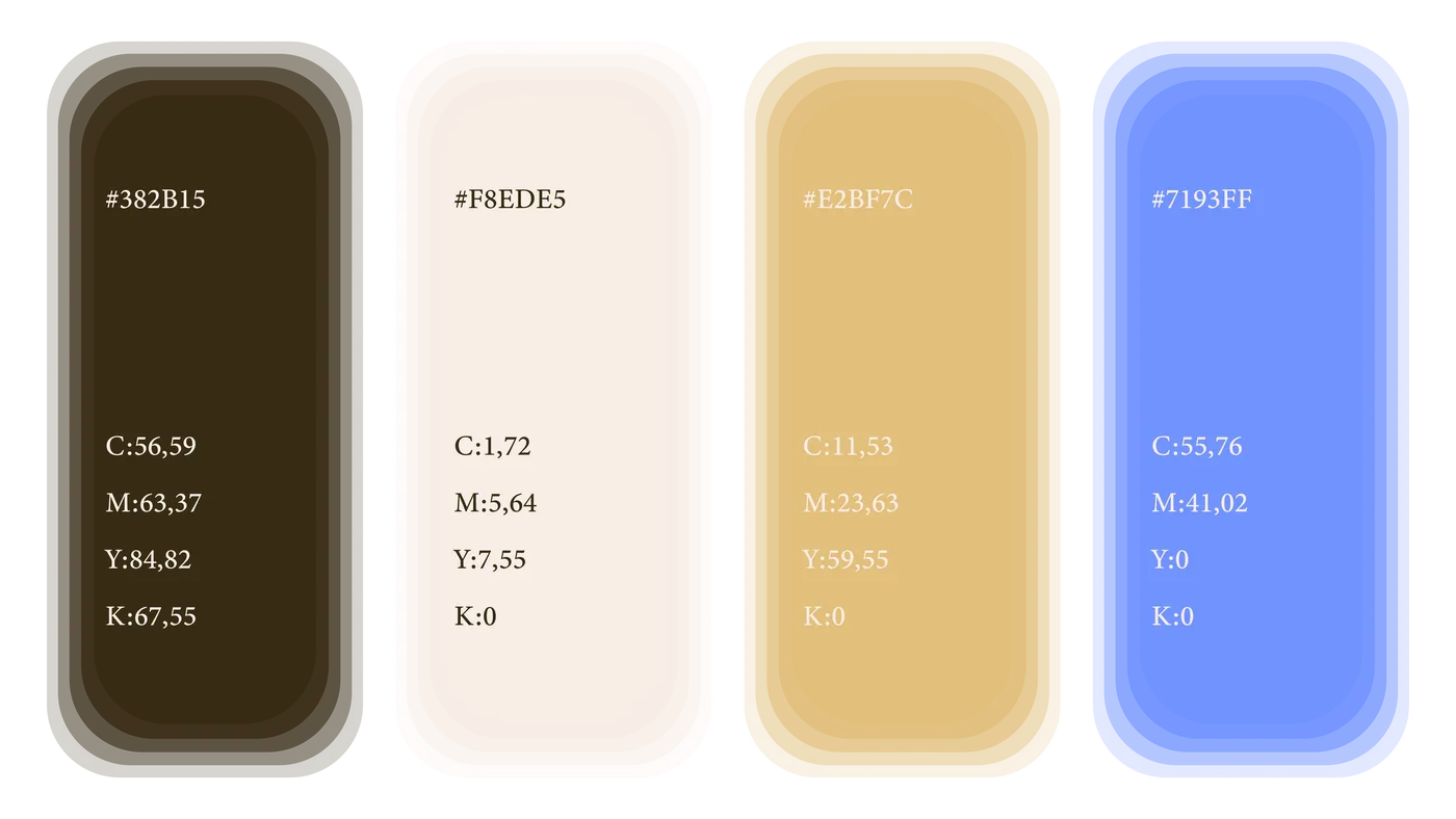
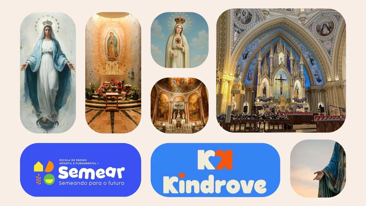
The palette starts from a strong symbolic charge tied to Catholic tradition. Light blue references Our Lady of Fátima and, alongside white, recalls the colors of her mantle: purity, serenity and spiritual protection.
White also stands for the Holy Spirit, representing light and peace. Brown evokes the tradition of the Church, humility and rooted faith. And gold expresses the beauty and sacredness of what is eternal.