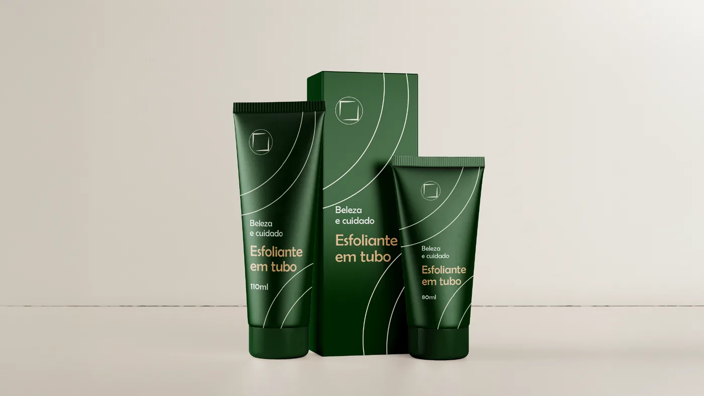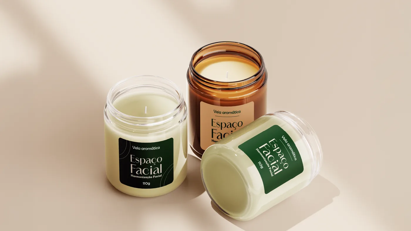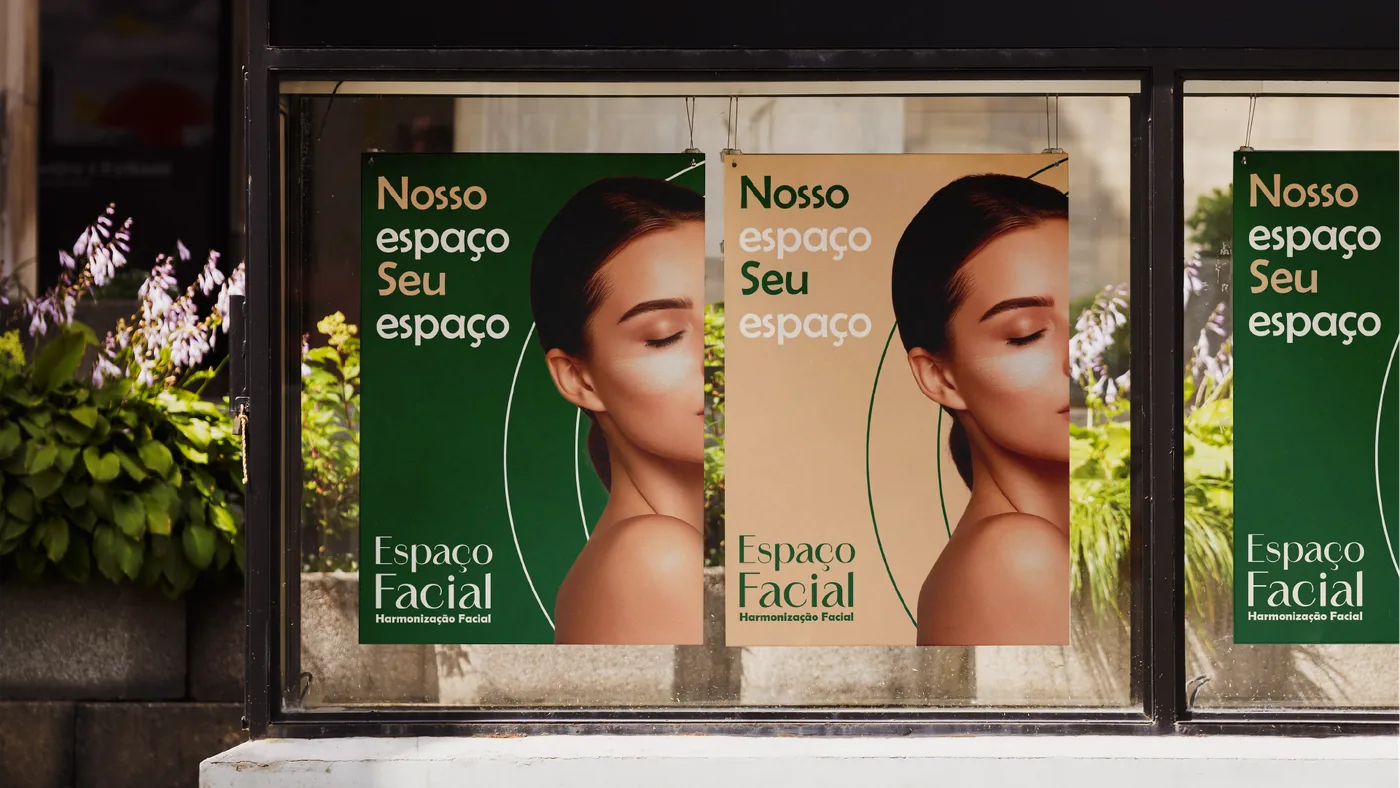
The clinic
Espaço Facial is a clinic built on high expertise and a commitment to beauty, self-esteem and well-being. With more than 16 years of experience and training at the M.A.R.C Institute in Miami, the world's largest facial anatomy center, came the need to innovate in the market: a space entirely dedicated to facial aesthetics, for women and men.
Combining quality and expertise, Espaço Facial offers a pleasant, comfortable and safe environment.
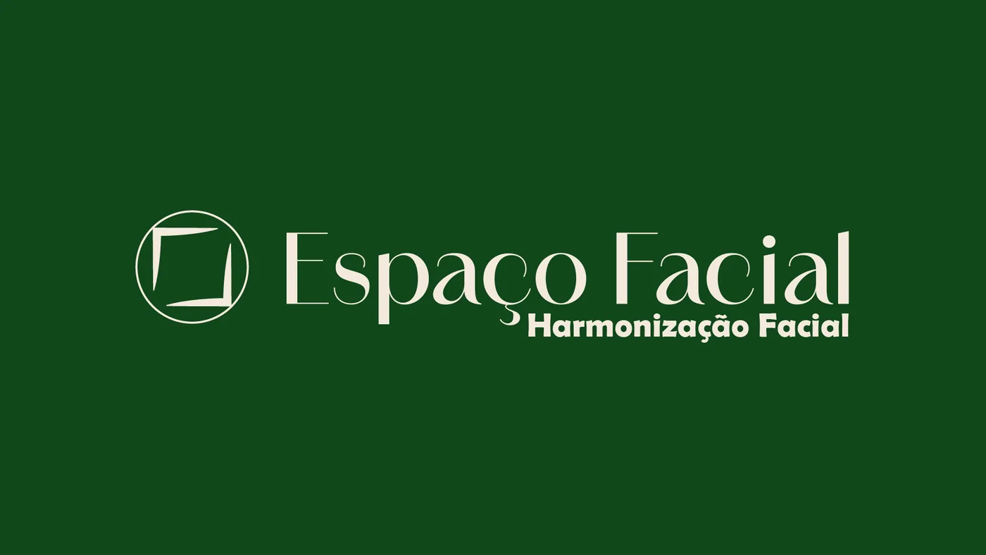
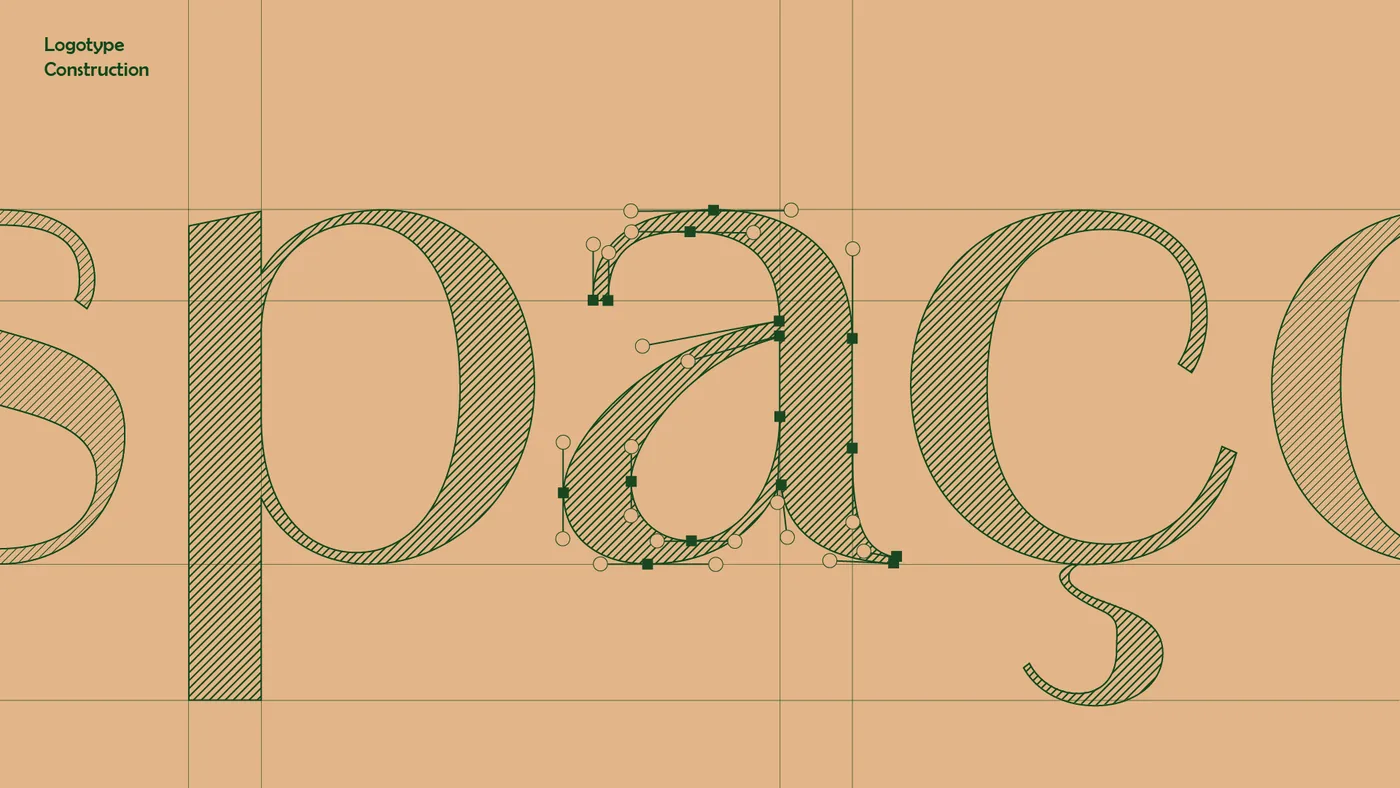
Symbol and typography
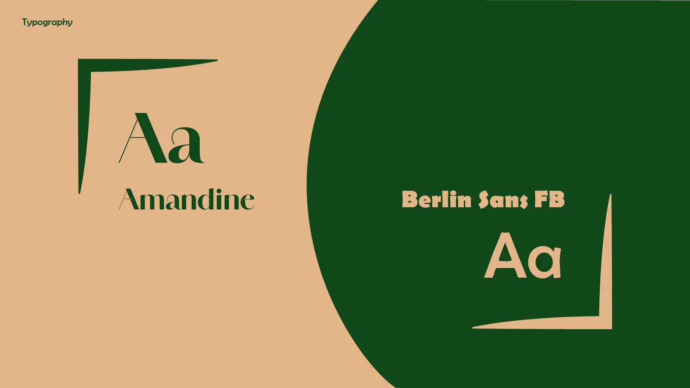
The visual identity combines sophistication and reassurance through its typographic choices. Amandine, with its varying stroke weight, stands for the transformation the procedures bring about. Berlin Sans FB, sturdier, conveys the safety and precision of the treatments.
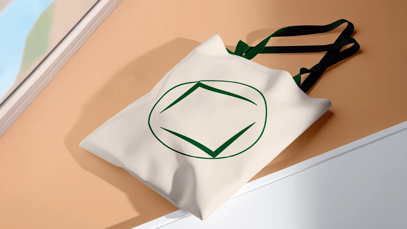
The symbol was built from a circle and two diagonals of a square that never touch, yet stay close. This structure represents facial harmonization and references the Vitruvian Man, a classic symbol of proportion and perfection.

Color
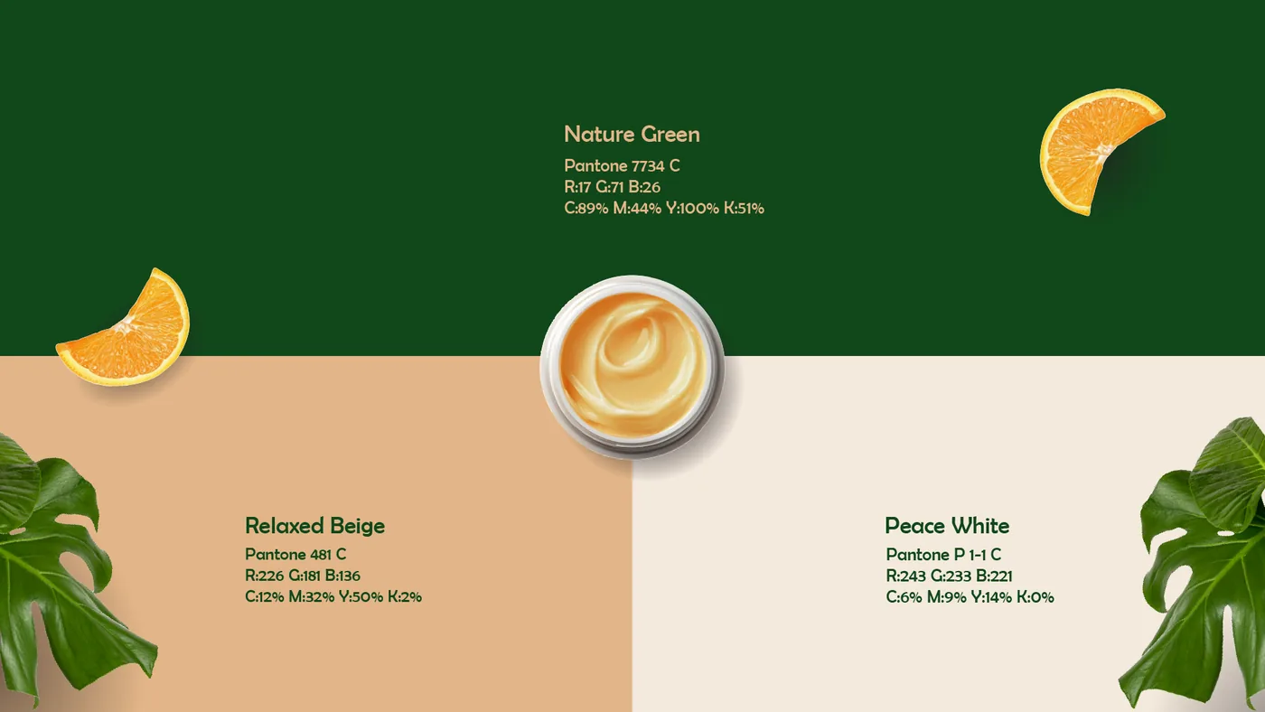
The palette was carefully chosen to convey the brand's values. Nature Green represents the connection to naturally based procedures, reinforcing authenticity and trust.
Peace White stands for peace and purity, carrying the idea of renewal. And Relaxed Beige evokes calm and warmth, making the experience even more comfortable.