The brand
Lugatone is a Catholic t-shirt brand from Rio de Janeiro. It was born at home, in 2020, made as a family, and the name comes from my initials. Today we are officially licensed by the Christ the Redeemer Sanctuary. I’m a co-founder and I look after the visual identity, the content and the digital side: from the logo to the ad, from the post to the store page.
This case doesn’t tell one identity, it tells two. The first was designed to attract a young audience. The second came from a business decision: changing the audience. Showing them side by side is the best way to explain what design does when the strategy changes.

Before: a brand for a young audience
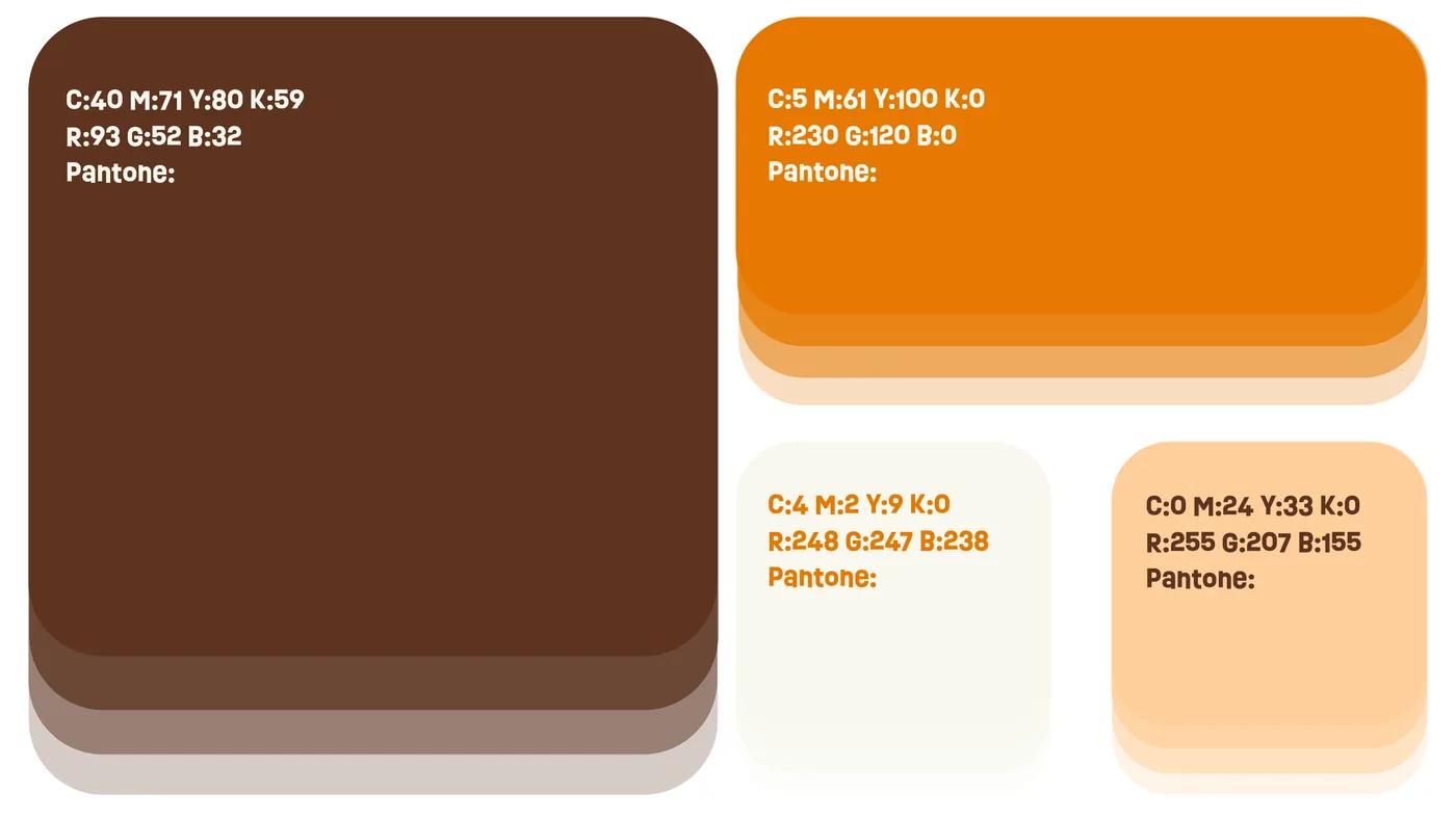
The first identity had a clear goal: to attract young people to a world that rarely speaks to them. The logo was sturdy and heavy, the colors were vibrant (strong orange over brown), the tone was playful and more disruptive, and the line that summed up the attitude was “Faith with style is a different story!”. The face of the brand was me, a 20-year-old man.
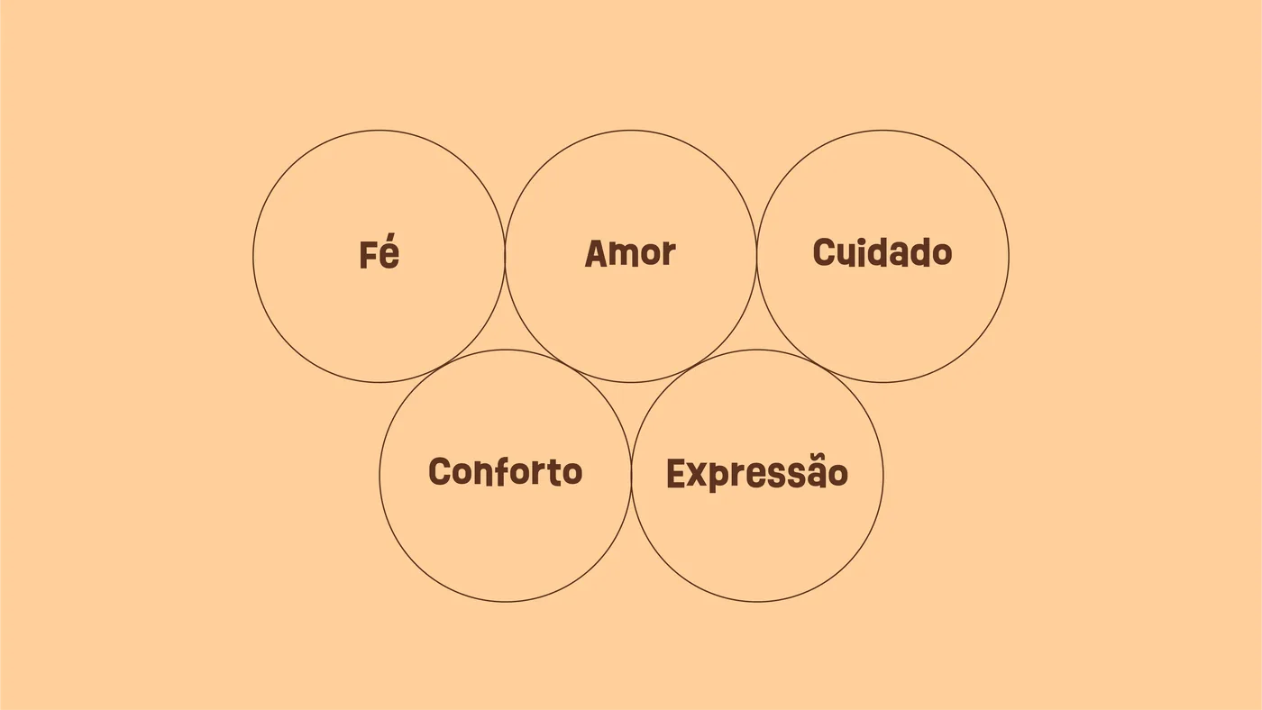
It was a complete system: defined values (faith, love, care, comfort and expression), a logo built from scratch, palette, typography, mockups and ad pieces. It had personality and consistency. What it didn’t have yet was results: sales were low, with one coming in every now and then.



The decision
Looking at who was buying and who could buy, the conclusion was simple: the brand was speaking to people who liked looking at it, not to the people who make the purchase. The audience with the most potential is the devout Catholic mother, aged 40 or older, who wears her faith every day and gives gifts to her family. A vibrant identity made to catch young people’s attention wasn’t speaking to her.
The problem stopped being how the brand looked and became who it was talking to. We decided to change audience, from the disruptive young crowd to families, with a focus on mothers.
After: a family brand, for real
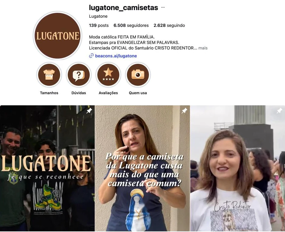
The shift started with a simple question: who is the face of this brand? The answer was already at home. Lugatone was born as a family, and the new identity started to embrace that. My mother, a 50-year-old woman, became the face of the brand instead of a 20-year-old man, and customers now see, in the communication, someone who looks like them.
The reel pinned to the top of the profile tells that story: how the brand was born at home, where the name comes from and what the mission is, to evangelize without words, in everyday life.
The logo followed that change of tone. The heavy, slanted wordmark gave way to a serif with a medieval inspiration, calmer and more solemn, with the tagline “fé que se reconhece” (faith you can recognize). The color moved too: the logo became a light beige, a color no Catholic brand uses as its main one, which gives Lugatone a space of its own in the buyer’s mind. And orange, which used to shout, now only points to what matters, like a deadline or a benefit.
The brand today
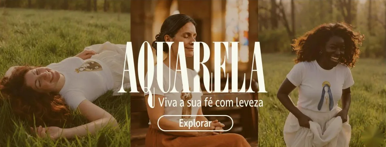
This is how Lugatone looks today. The Instagram profile opens with the new logo, highlights in brown and beige, and the family reels pinned at the top. In the store, the banners swapped orange for real photos, tall cream typography and the beige logo in the header. In collection launches, the pieces follow the same language: beige background, serif type and little orange.




The result
Before, sales were low and came in now and then. Today, sales happen practically every day and the brand keeps growing. It’s not a closed case, it’s a brand in progress, but the results are already better than those of the first version.
The identity didn’t do this alone: it came with a change of audience, content and ads. But it was the identity that gave consistency to all of it.
What I take from it
A beautiful identity isn’t enough if it speaks to the wrong person. Redesigning a brand I created myself taught me to separate my own taste from what the brand needs, and to treat design as part of business strategy, not as finishing.