lugatone

[PT/BR]
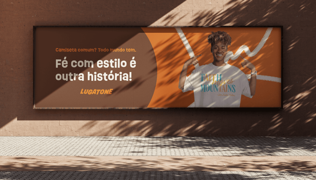
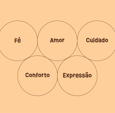
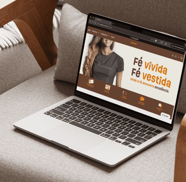
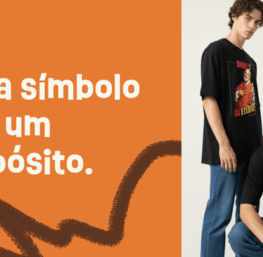
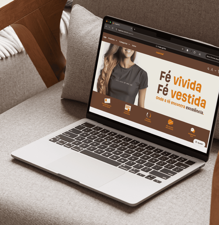
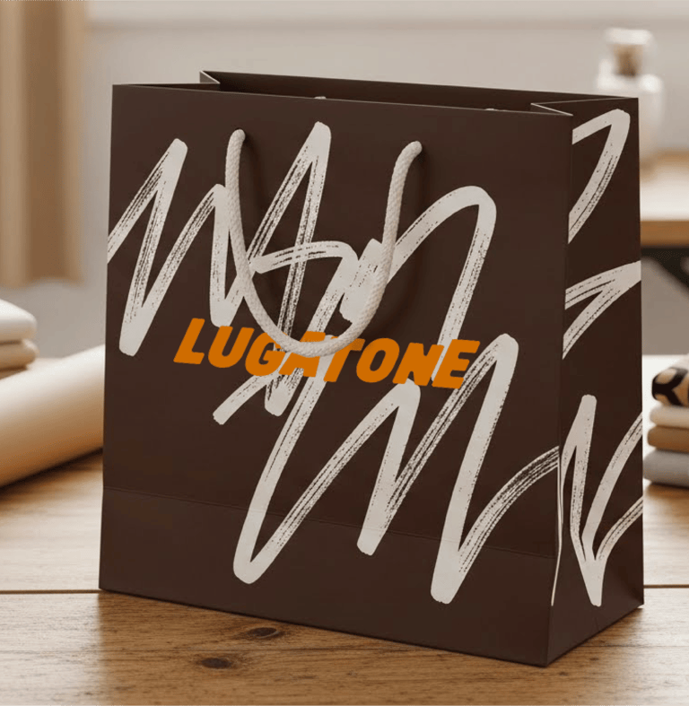
A Lugatone é uma marca de roupas católicas que nasce do desejo de expressar a fé de forma autêntica,
contemporânea e cheia de significado. Mais do que criar camisetas, o projeto transforma a espiritualidade em algo visível no cotidiano, usando a moda como meio de evangelização, identidade e afeto.
A construção da Lugatone mostra que marcas com propósito não surgem apenas de tendências visuais, mas de decisões conscientes, valores bem definidos e uma intenção verdadeira.
Este projeto reflete a união entre estratégia, fé e design, dando forma a uma marca que não apenas comunica, mas testemunha.
[EN]
Lugatone is a Catholic apparel brand born from the desire to express faith in an authentic, contemporary, and meaningful way. More than creating t-shirts, the project transforms spirituality into something visible in everyday life, using fashion as a means of evangelization, identity, and affection.
The construction of Lugatone shows that purpose-driven brands are not built solely from visual trends, but from conscious decisions, well-defined values, and genuine intent.
This project reflects the union of strategy, faith, and design, shaping a brand that does not merely communicate, but bears witness.


[PT/BR]
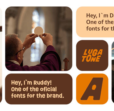
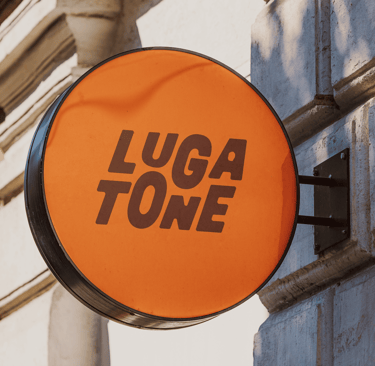
A tipografia da Lugatone foi pensada como um ponto de equilíbrio entre tradição e contemporaneidade.
Seu desenho é robusto e pesado, carregando visualmente o peso simbólico da tradição cristã, da fé que atravessa séculos e sustenta gerações. As letras firmes transmitem solidez, confiança e permanência, valores centrais da marca.
Ao mesmo tempo, essa tipografia não é rígida nem estática. Ela passa por deformações sutis e intencionais, quebrando a perfeição clássica para representar a modernidade, a juventude e a vivacidade do público que a Lugatone conversa hoje. Essas imperfeições controladas trazem movimento, proximidade e atualidade, afastando a marca de uma estética engessada ou excessivamente tradicional.
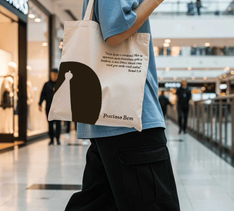
Um detalhe central está no interior da letra “A”, que não funciona apenas como um espaço negativo gráfico. Elesimboliza a abertura do túmulo na Ressurreição de Cristo: um vazio que não representa ausência, mas vitória, vida nova e esperança. É um espaço de luz, que reforça a fé como algo vivo, aberto e presente.
Assim, a tipografia da Lugatone não é apenas um suporte visual, mas um elemento narrativo. Ela sustenta o passado, dialoga com o presente e aponta para uma fé que continua se renovando.
[EN]
Lugatone’s typography was designed as a balance between tradition and contemporaneity.
Its structure is bold and heavy, visually carrying the weight of Christian tradition and a faith that has endured for centuries. The solid letterforms convey strength, trust, and permanence, values that lie at the core of the brand.
At the same time, the typeface is not rigid or static. It features subtle and intentional deformations, breaking away from classical perfection to express the modernity, youthfulness, and energy of Lugatone’s target audience. These controlled irregularities add movement and approachability, keeping the brand from feeling outdated or overly traditional.
A key detail appears in the counter of the letter “A”, which goes beyond a purely graphic function. It references the open tomb of Christ’s Resurrection: an empty space that does not symbolize absence, but victory, new life, and hope. It is a moment of light within the form, reinforcing faith as something alive, open, and present.
In this way, Lugatone’s typography is not merely a visual element, but a narrative one. It carries the past, speaks to the present, and points toward a faith that continues to renew itself.


[PT/BR]
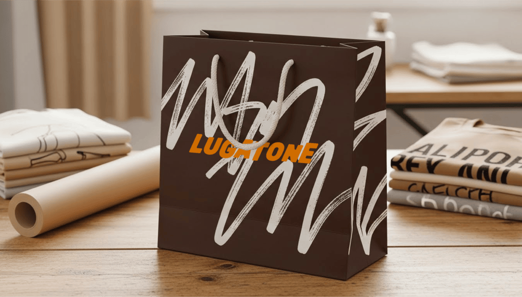
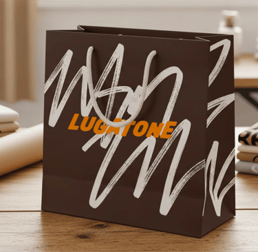
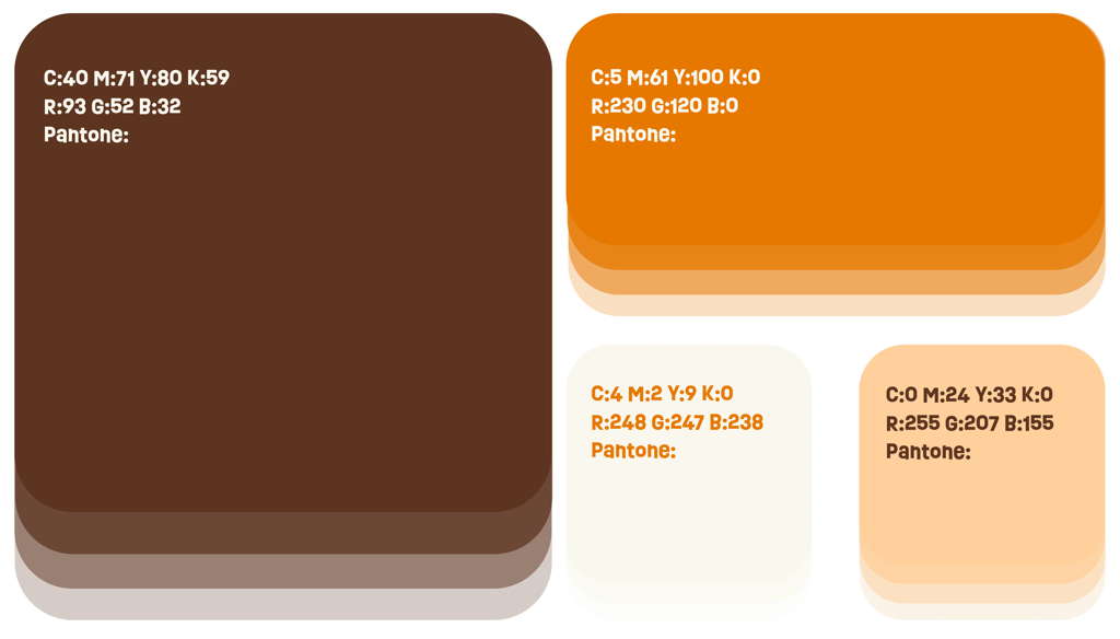
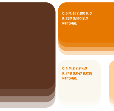
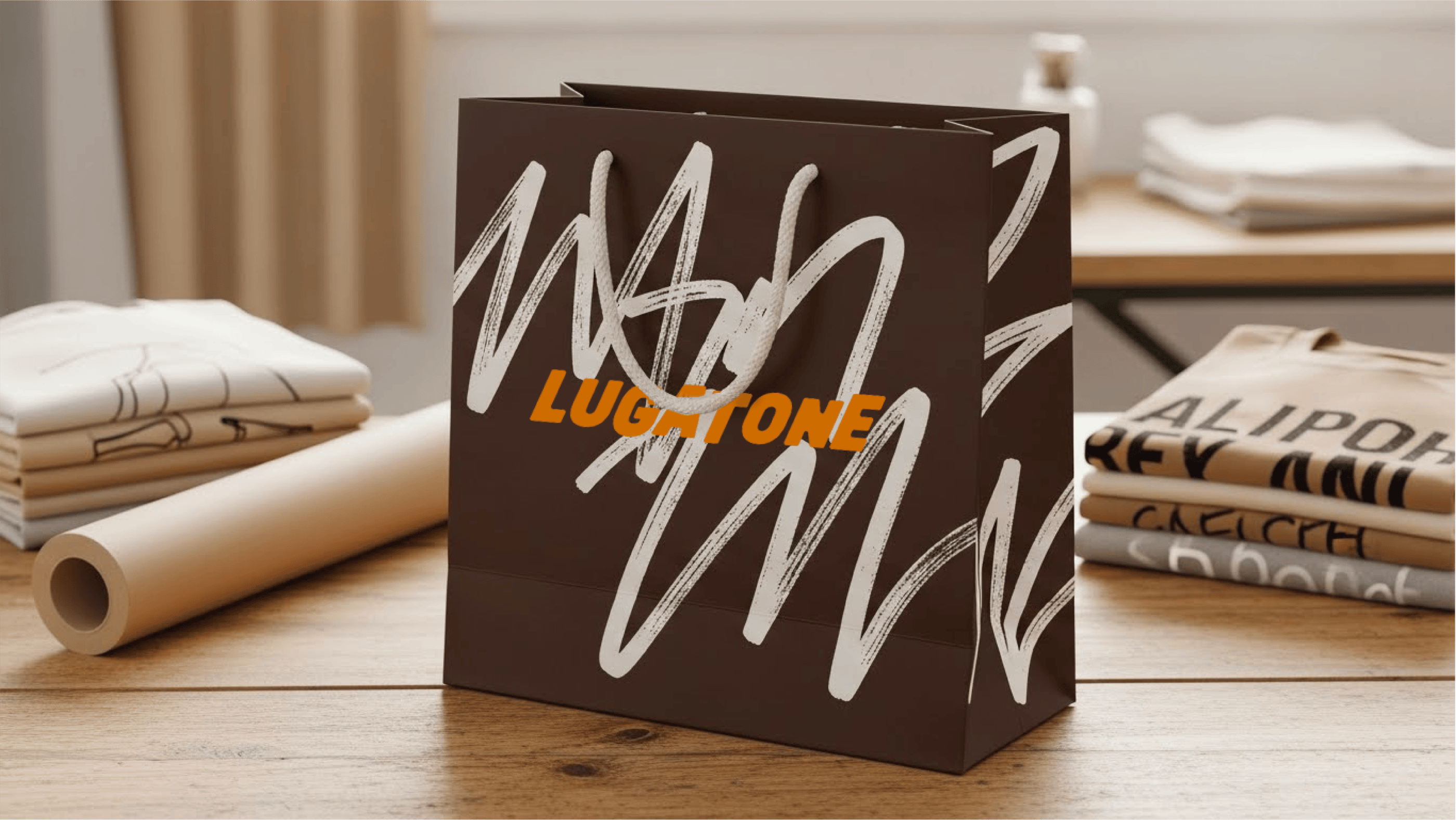
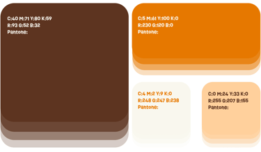
A paleta de cores da Lugatone foi construída para traduzir a fé em sensações visuais, equilibrando tradição, espiritualidade e contemporaneidade.
O marrom estabelece a base da identidade, remetendo à tradição da Igreja e à força simbólica da cruz, sinal do sacrifício de Cristo e da fé que sustenta a marca. Ele traz profundidade, solidez e respeito às raízes cristãs. Em contraste, o laranja surge como expressão de jovialidade e modernidade, representando também o fogo do Espírito Santo: presença viva, movimento e renovação. É a cor que aquece a identidade e conecta a fé ao dinamismo do público jovem.
O branco aparece como espaço de respiro, simbolizando paz, luz e a ação do Espírito Santo. Ele reforça a pureza da mensagem e cria equilíbrio visual. Já o bege complementa a paleta com suavidade, trazendo uma sensação de calma, acolhimento e cuidado, aproximando a marca das pessoas de forma humana e sensível.
Juntas, essas cores constroem uma identidade que une tradição e renovação, sacrifício e esperança, força e afeto, refletindo a missão da Lugatone de expressar a fé de maneira viva, acessível e significativa.
[EN]
Lugatone’s color palette was developed to translate faith into visual emotion, balancing tradition, spirituality, and contemporaneity.
Brown forms the foundation of the identity, referencing the tradition of the Church and the symbolic strength of the cross, representing Christ’s sacrifice and the roots of faith that sustain the brand. In contrast, orange brings youthfulness and modernity, while also symbolizing the fire of the Holy Spirit: a living presence marked by movement, warmth, and renewal. It energizes the identity and connects faith to action.
White creates moments of visual breathing space, symbolizing peace, light, and the presence of the Holy Spirit, reinforcing clarity and spiritual balance. Beige completes the palette with softness, conveying calm, care, and a sense of welcome, making the brand feel approachable and human.
Together, these colors build an identity that unites tradition and renewal, sacrifice and hope, strength and affection, reflecting Lugatone’s mission to express faith in a way that is alive, accessible, and deeply meaningful.
lugatone

[PT/BR]
A tipografia da Lugatone foi pensada como um ponto de equilíbrio entre tradição e contemporaneidade.
Seu desenho é robusto e pesado, carregando visualmente o peso simbólico da tradição cristã, da fé que atravessa séculos e sustenta gerações. As letras firmes transmitem solidez, confiança e permanência, valores centrais da marca.
Ao mesmo tempo, essa tipografia não é rígida nem estática. Ela passa por deformações sutis e intencionais, quebrando a perfeição clássica para representar a modernidade, a juventude e a vivacidade do público que a Lugatone conversa hoje. Essas imperfeições controladas trazem movimento, proximidade e atualidade, afastando a marca de uma estética engessada ou excessivamente tradicional.
Um detalhe central está no interior da letra “A”, que não funciona apenas como um espaço negativo gráfico. Elesimboliza a abertura do túmulo na Ressurreição de Cristo: um vazio que não representa ausência, mas vitória, vida nova e esperança. É um espaço de luz, que reforça a fé como algo vivo, aberto e presente.
Assim, a tipografia da Lugatone não é apenas um suporte visual, mas um elemento narrativo. Ela sustenta o passado, dialoga com o presente e aponta para uma fé que continua se renovando.
[EN]
Lugatone’s typography was designed as a balance between tradition and contemporaneity.
Its structure is bold and heavy, visually carrying the weight of Christian tradition and a faith that has endured for centuries. The solid letterforms convey strength, trust, and permanence, values that lie at the core of the brand.
At the same time, the typeface is not rigid or static. It features subtle and intentional deformations, breaking away from classical perfection to express the modernity, youthfulness, and energy of Lugatone’s target audience. These controlled irregularities add movement and approachability, keeping the brand from feeling outdated or overly traditional.
A key detail appears in the counter of the letter “A”, which goes beyond a purely graphic function. It references the open tomb of Christ’s Resurrection: an empty space that does not symbolize absence, but victory, new life, and hope. It is a moment of light within the form, reinforcing faith as something alive, open, and present.
In this way, Lugatone’s typography is not merely a visual element, but a narrative one. It carries the past, speaks to the present, and points toward a faith that continues to renew itself.


[PT/BR]
A paleta de cores da Lugatone foi construída para traduzir a fé em sensações visuais, equilibrando tradição, espiritualidade e contemporaneidade.
O marrom estabelece a base da identidade, remetendo à tradição da Igreja e à força simbólica da cruz, sinal do sacrifício de Cristo e da fé que sustenta a marca. Ele traz profundidade, solidez e respeito às raízes cristãs. Em contraste, o laranja surge como expressão de jovialidade e modernidade, representando também o fogo do Espírito Santo: presença viva, movimento e renovação. É a cor que aquece a identidade e conecta a fé ao dinamismo do público jovem.
O branco aparece como espaço de respiro, simbolizando paz, luz e a ação do Espírito Santo. Ele reforça a pureza da mensagem e cria equilíbrio visual. Já o bege complementa a paleta com suavidade, trazendo uma sensação de calma, acolhimento e cuidado, aproximando a marca das pessoas de forma humana e sensível.
Juntas, essas cores constroem uma identidade que une tradição e renovação, sacrifício e esperança, força e afeto, refletindo a missão da Lugatone de expressar a fé de maneira viva, acessível e significativa.
[EN]
Lugatone’s color palette was developed to translate faith into visual emotion, balancing tradition, spirituality, and contemporaneity.
Brown forms the foundation of the identity, referencing the tradition of the Church and the symbolic strength of the cross, representing Christ’s sacrifice and the roots of faith that sustain the brand. In contrast, orange brings youthfulness and modernity, while also symbolizing the fire of the Holy Spirit: a living presence marked by movement, warmth, and renewal. It energizes the identity and connects faith to action.
White creates moments of visual breathing space, symbolizing peace, light, and the presence of the Holy Spirit, reinforcing clarity and spiritual balance. Beige completes the palette with softness, conveying calm, care, and a sense of welcome, making the brand feel approachable and human.
Together, these colors build an identity that unites tradition and renewal, sacrifice and hope, strength and affection, reflecting Lugatone’s mission to express faith in a way that is alive, accessible, and deeply meaningful.
[PT/BR]
A Lugatone é uma marca de roupas católicas que nasce do desejo de expressar a fé de forma autêntica,
contemporânea e cheia de significado. Mais do que criar camisetas, o projeto transforma a espiritualidade em algo visível no cotidiano, usando a moda como meio de evangelização, identidade e afeto.
A construção da Lugatone mostra que marcas com propósito não surgem apenas de tendências visuais, mas de decisões conscientes, valores bem definidos e uma intenção verdadeira.
Este projeto reflete a união entre estratégia, fé e design, dando forma a uma marca que não apenas comunica, mas testemunha.
[EN]
Lugatone is a Catholic apparel brand born from the desire to express faith in an authentic, contemporary, and meaningful way. More than creating t-shirts, the project transforms spirituality into something visible in everyday life, using fashion as a means of evangelization, identity, and affection.
The construction of Lugatone shows that purpose-driven brands are not built solely from visual trends, but from conscious decisions, well-defined values, and genuine intent.
This project reflects the union of strategy, faith, and design, shaping a brand that does not merely communicate, but bears witness.


Contato
Vamos trabalhar juntos em seu próximo projeto?
Telefone
luisgtneves@gmail.com
+55 (21) 98824-0348
© 2026. All rights reserved.
páginas