precioso bem

[PT/BR]
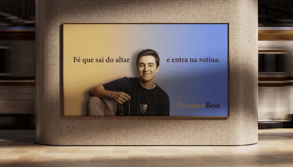
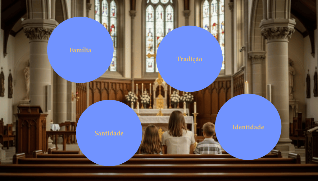
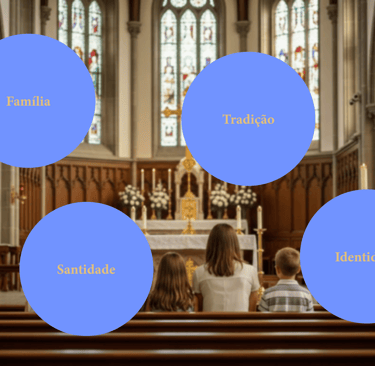
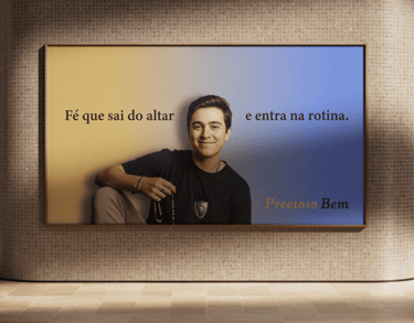
Precioso Bem nasce no coração de uma família católica, onde a fé sempre foi mais do que tradição: é presença diária, partilha e testemunho. Inspirada pelos valores do catolicismo apostólico romano, a marca transforma devoção em gesto concreto, criando itens religiosos que acompanham a vida espiritual com significado, beleza e respeito àquilo que é sagrado.
Cada peça carrega intenção, cuidado e um profundo senso de propósito, refletindo o amor de uma família grande, unida e comprometida em evangelizar também pelos detalhes.
[EG]
Precioso Bem is born at the heart of a Catholic family, where faith has always been more than tradition: it is daily presence, shared life, and living witness. Inspired by the values of Roman Catholicism, the brand transforms devotion into a tangible expression, creating religious items that accompany spiritual life with meaning, beauty, and reverence for what is sacred.
Each piece carries intention, care, and a deep sense of purpose, reflecting the love of a large, united family
committed to evangelizing even through the smallest details.
[PT/BR]
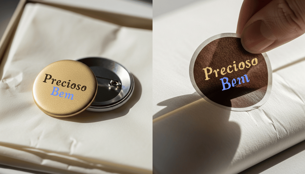
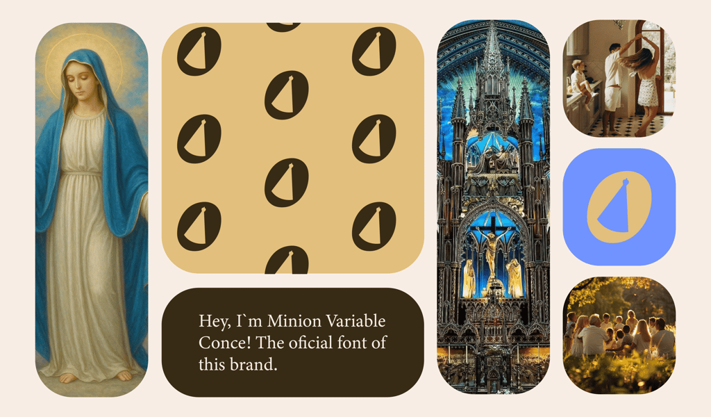
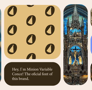
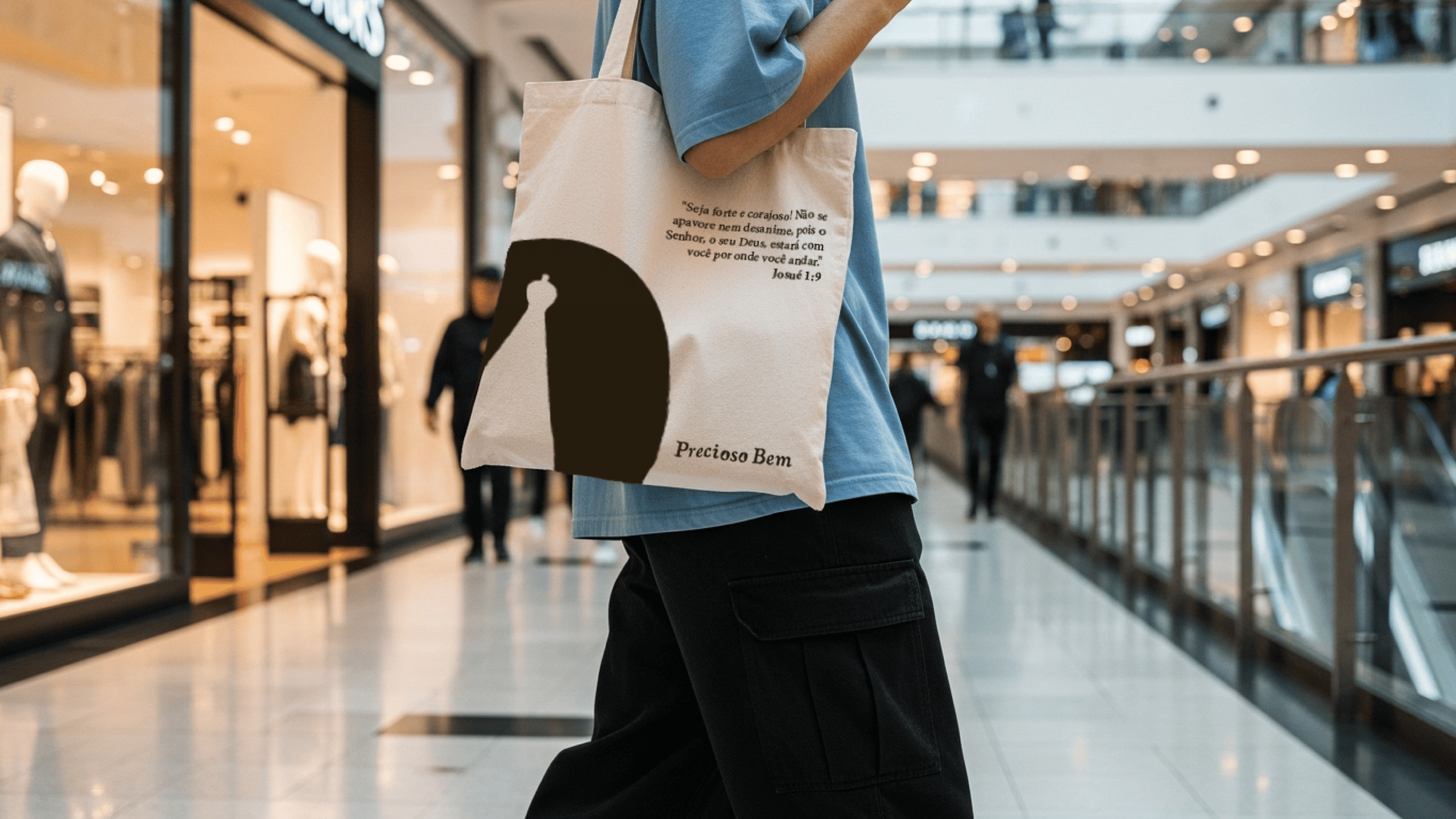
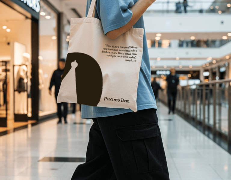
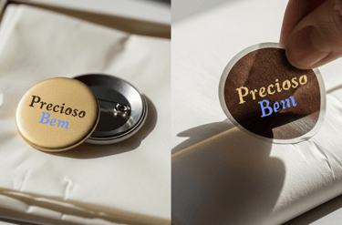
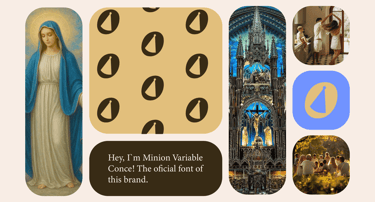
A tipografia da Precioso Bem foi pensada como um elo entre tradição, espiritualidade e acolhimento. A escolha por uma fonte serifada reforça a herança histórica da Igreja, transmitindo seriedade, respeito e atemporalidade. Essa tipografia está presente tanto no logotipo quanto nos textos corridos.
No logotipo, as bordas levemente arredondadas suavizam a estrutura clássica da fonte, trazendo uma sensação de bondade, proximidade e acolhimento. Essa decisão simboliza o amor misericordioso de Deus e a ternura de Nossa Senhora, pilares centrais da fé católica e da essência da marca.
Como elemento distintivo, a letra “O” do logotipo foi estilizada com a imagem de Nossa Senhora Aparecida em espaço negativo. Esse recurso gráfico transforma a tipografia em símbolo, adicionando significado espiritual e singularidade à marca, ao mesmo tempo em que reforça sua identidade religiosa de forma sutil, respeitosa e memorável.
[EG]
The typography of Precioso Bem was designed as a bridge between tradition, spirituality, and warmth. The choice of a serif typeface reinforces the historical heritage of the Church, conveying seriousness, respect, and timelessness. This typography is used consistently both in the logotype and in body text.
In the logotype, the slightly rounded edges soften the classical structure of the typeface, bringing a sense of kindness, closeness, and welcome. This decision symbolizes God’s merciful love and the tenderness of Our Lady, central pillars of the Catholic faith and of the brand’s essence.
As a distinctive element, the letter “O” in the logotype was stylized with the image of Our Lady of Aparecida in negative space. This graphic feature transforms typography into a symbol, adding spiritual meaning and uniqueness to the brand while reinforcing its religious identity in a subtle, respectful, and memorable way.


[PT/BR]
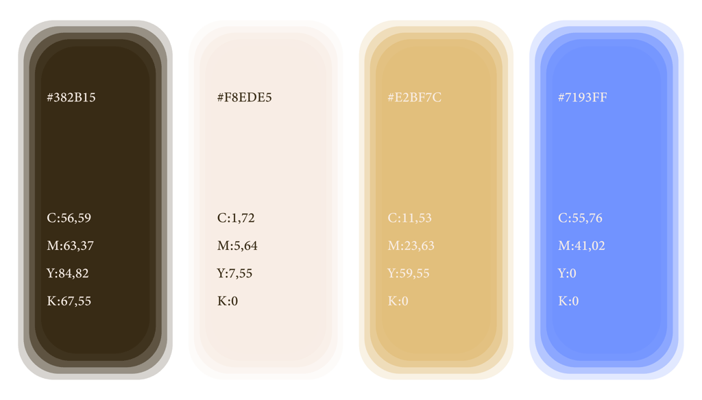
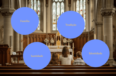
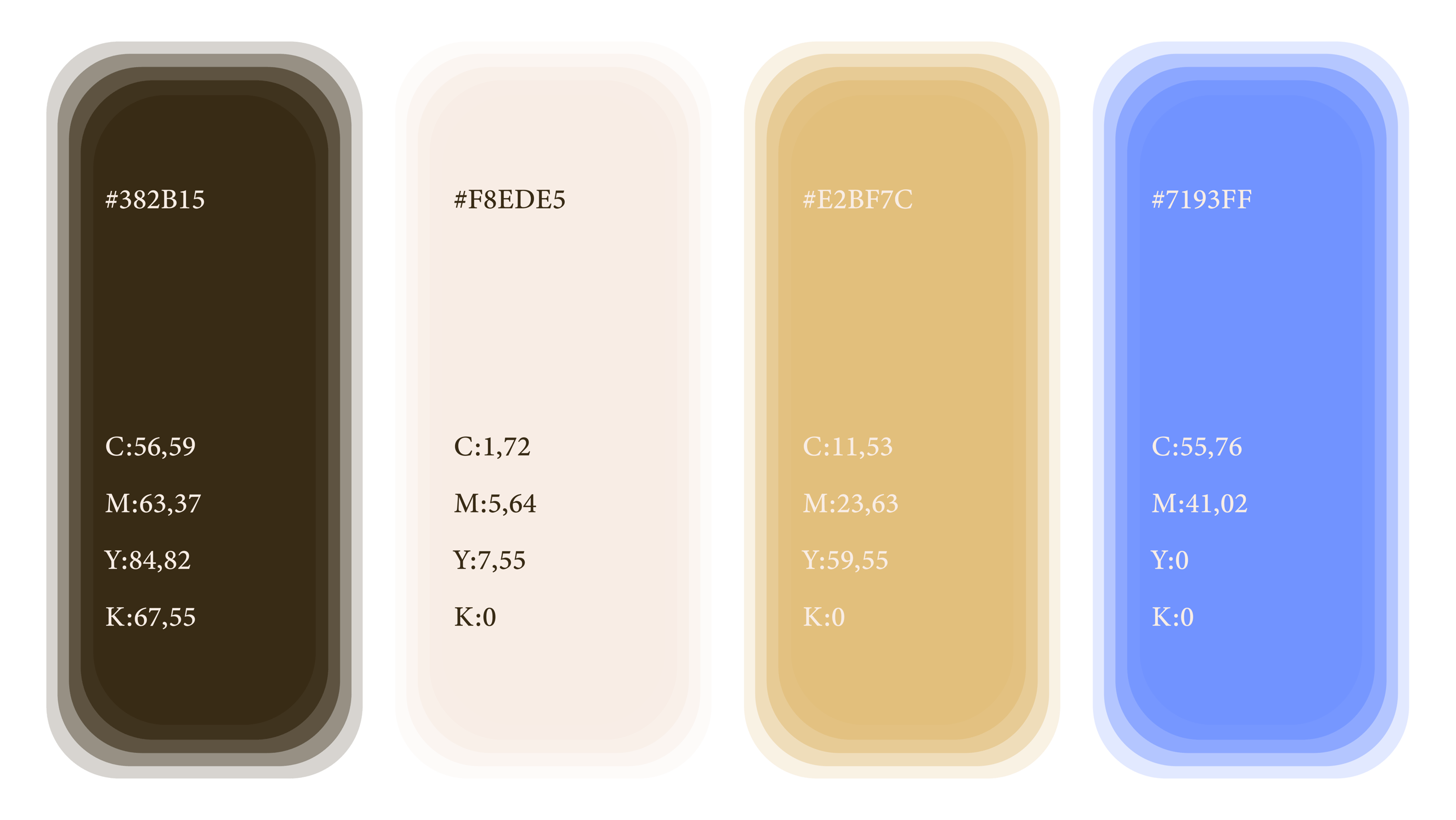
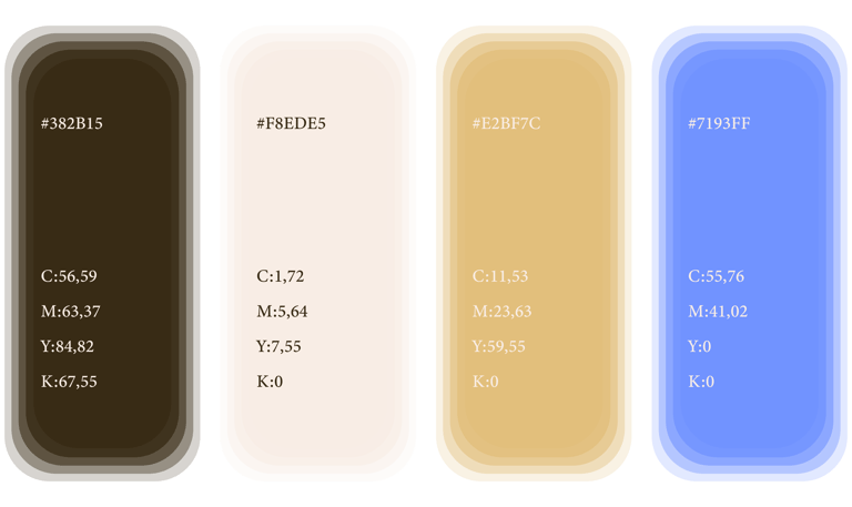
A paleta de cores da Precioso Bem foi definida a partir de uma forte carga simbólica ligada à tradição católica. O azul claro foi escolhido em referência a Nossa Senhora de Fátima e, em conjunto com o branco, remete às cores de seu manto, transmitindo pureza, serenidade e proteção espiritual.
O branco também simboliza o Espírito Santo, representando luz, paz e presença divina. Essa cor reforça a base espiritual da marca e contribui para uma comunicação visual clara, leve e equilibrada.
O marrom representa a tradição da Igreja, evocando humildade, história e fé enraizada. Já o dourado simboliza a beleza e a sacralidade da Igreja, expressando reverência, devoção e o valor do que é eterno.
[EG]
The color palette of Precioso Bem was defined with strong symbolic intention rooted in Catholic tradition. Light blue was chosen in reference to Our Lady of Fátima, paired with white to evoke the colors of her mantle. Together, these tones convey purity, serenity, and spiritual protection.
The color white also represents the Holy Spirit, symbolizing light, peace, and divine presence. It reinforces the brand’s spiritual foundation and brings balance and clarity to the visual system.
Brown was selected to represent the tradition of the Church, evoking humility, history, and grounded faith.
Meanwhile, gold symbolizes the beauty and sacredness of the Church, reflecting reverence, devotion, and the value of what is eternal.

precioso bem

[PT/BR]
A tipografia da Precioso Bem foi pensada como um elo entre tradição, espiritualidade e acolhimento. A escolha por uma fonte serifada reforça a herança histórica da Igreja, transmitindo seriedade, respeito e atemporalidade. Essa tipografia está presente tanto no logotipo quanto nos textos corridos.
No logotipo, as bordas levemente arredondadas suavizam a estrutura clássica da fonte, trazendo uma sensação de bondade, proximidade e acolhimento. Essa decisão simboliza o amor misericordioso de Deus e a ternura de Nossa Senhora, pilares centrais da fé católica e da essência da marca.
Como elemento distintivo, a letra “O” do logotipo foi estilizada com a imagem de Nossa Senhora Aparecida em espaço negativo. Esse recurso gráfico transforma a tipografia em símbolo, adicionando significado espiritual e singularidade à marca, ao mesmo tempo em que reforça sua identidade religiosa de forma sutil, respeitosa e memorável.
[EG]
The typography of Precioso Bem was designed as a bridge between tradition, spirituality, and warmth. The choice of a serif typeface reinforces the historical heritage of the Church, conveying seriousness, respect, and timelessness. This typography is used consistently both in the logotype and in body text.
In the logotype, the slightly rounded edges soften the classical structure of the typeface, bringing a sense of kindness, closeness, and welcome. This decision symbolizes God’s merciful love and the tenderness of Our Lady, central pillars of the Catholic faith and of the brand’s essence.
As a distinctive element, the letter “O” in the logotype was stylized with the image of Our Lady of Aparecida in negative space. This graphic feature transforms typography into a symbol, adding spiritual meaning and uniqueness to the brand while reinforcing its religious identity in a subtle, respectful, and memorable way.


[PT/BR]
A paleta de cores da Precioso Bem foi definida a partir de uma forte carga simbólica ligada à tradição católica. O azul claro foi escolhido em referência a Nossa Senhora de Fátima e, em conjunto com o branco, remete às cores de seu manto, transmitindo pureza, serenidade e proteção espiritual.
O branco também simboliza o Espírito Santo, representando luz, paz e presença divina. Essa cor reforça a base espiritual da marca e contribui para uma comunicação visual clara, leve e equilibrada.
O marrom representa a tradição da Igreja, evocando humildade, história e fé enraizada. Já o dourado simboliza a beleza e a sacralidade da Igreja, expressando reverência, devoção e o valor do que é eterno.
[EG]
The color palette of Precioso Bem was defined with strong symbolic intention rooted in Catholic tradition. Light blue was chosen in reference to Our Lady of Fátima, paired with white to evoke the colors of her mantle. Together, these tones convey purity, serenity, and spiritual protection.
The color white also represents the Holy Spirit, symbolizing light, peace, and divine presence. It reinforces the brand’s spiritual foundation and brings balance and clarity to the visual system.
Brown was selected to represent the tradition of the Church, evoking humility, history, and grounded faith.
Meanwhile, gold symbolizes the beauty and sacredness of the Church, reflecting reverence, devotion, and the value of what is eternal.
[PT/BR]
Precioso Bem nasce no coração de uma família católica, onde a fé sempre foi mais do que tradição: é presença diária, partilha e testemunho. Inspirada pelos valores do catolicismo apostólico romano, a marca transforma devoção em gesto concreto, criando itens religiosos que acompanham a vida espiritual com significado, beleza e respeito àquilo que é sagrado.
Cada peça carrega intenção, cuidado e um profundo senso de propósito, refletindo o amor de uma família grande, unida e comprometida em evangelizar também pelos detalhes.
[EG]
Precioso Bem is born at the heart of a Catholic family, where faith has always been more than tradition: it is daily presence, shared life, and living witness. Inspired by the values of Roman Catholicism, the brand transforms devotion into a tangible expression, creating religious items that accompany spiritual life with meaning, beauty, and reverence for what is sacred.
Each piece carries intention, care, and a deep sense of purpose, reflecting the love of a large, united family
committed to evangelizing even through the smallest details.


Contato
Vamos trabalhar juntos em seu próximo projeto?
Telefone
luisgtneves@gmail.com
+55 (21) 98824-0348
© 2026. All rights reserved.
páginas